How did I get here? The recursion monitor is a useful tool (conceived by Total’s LP group, implemented by Daniel) as it provides an easy way to see what is going on with the recursed parts of your model across each recursion pass. Looking at the final reports only ever shows you where you arrived, not how you got there. Taking a look at what is going on during earlier passes will give you insights into a model’s solution path and help you resolve problems with instability and infeasibilty.
Like many of the analysis tools included in GRTMPS, it depends on the solution database, so see Note # 26 Creating Solution MDB for options for making this file if you are not familiar with creating it. It will only contain the information that you need for the monitor if you ask the system to retain the pass-by-pass data by ticking the "Pool, distributions and properties, by pass" option on the Output panel, like so:
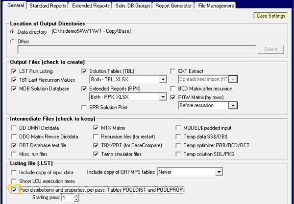
This corresponds to setting PASSREP in TABLE OPTION, where the entry should be the starting pass. I always take the data from the beginning - pass 1. While storing less than the full recursion might be more efficient you will just end up wondering what came before if you start later. (Except for super huge models that run lots of passes, where you can actually run out of memory if you try to keep everything.) Once the run has completed and you have your solution MDB, put your cursor on the run node in the tree and open Recursion Monitor from the Tools menu. (If you weren’t in the right place, you can browse to your solution MDB in the output folder, using the File option)
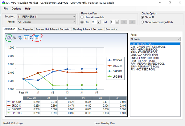
At the top, you select which location and period to view. If you have a multi-location and / or multi-period model it is easy to fall into the habit of just looking at the first ones; remember to jump about a bit and sample other times and places. You can also set filters on Recursion Pass, to see all or just some of the data – if you have a lot of passes, looking at a sub-set might make it easier to get a feel for values. The “Display Option” allows you to show all or only the non-converged items. It can of course be useful to reduce the set to only what is not converged, particularly if you have run that didn't converge, but sometimes it blanks out so much data – as it removes parts of the curves – that you can’t see enough to make sense of it.
The first tab is for looking at distribution factors - the fraction of pool that goes to each possible destination. (See How Distributed Recursion Solves the Pooling Problem) You can see that the Butane pool started off with the default assumption of equal fractions to its four possible destinations, and that the sale dropped out to zero early on. The bottom grid displaying the values is optional, and can be toggled on and off using the right-most of the little buttons in the upper left corner of the graph panel, circled in red. The list of pools on the left defaults to All Pools, but you can also choose to filter to just Mogas, or Distillate. If you have product display groups set up for the database tree, those sub-sets will also be in the drop-down list. (If you are using a table-based model, you can make such groups using TABLEs R17.0 and R17.1; See the reference manual for details.) You can look at multiple pools at the same time – as long as that doesn’t result in so many lines you can’t make any sense of it. Move the cursor around on the graph and you can highlight various parts. Hover on an item in the legend box, a line on the graph or numbers in the grid and the corresponding elements will be emphasized in the other parts of the display.
To see properties, move to the next tab where you can filter by pool or by property.
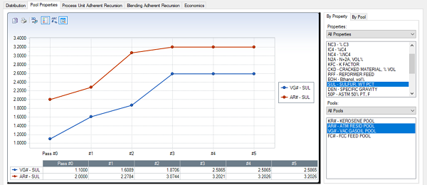
Here, I am selecting SUL and the Pools section on the bottom shows me the ones that track it, of which I have selected two for the graph. Alternatively, you can move over to the By Pool tab, selecting pool streams from the top grid, and choosing from the list of tracked properties at the bottom. It is best to stick to groups of qualities which measured are in similar units – so that they fit well together on the same x-axis.
Don’t be fooled by the scale, as it is set dynamically based on the values to be displayed. An apparently large change might just be the effect of zooming in on a movement within a very narrow range – while something that looks flat might just be on a particularly long axis because of an extreme value or pools occupying different ranges. The graph shows the actual value for each pass (in index if one is used), as calculated from the solution. This is most often the same as the next assumed value but could be different if you are using dampening or the recursion update cascading algorithm adjusts it to keep it within the feasible range or consistent with other pools. You need to look in the recursion logs in the LST file if you want to see what is going one with assumed values.
The Process Unit Adherent Recursion tab shows the results for process unit attributes that are being calculated from simulators or internal AR definitions.
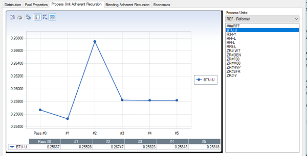
For each process unit in the list you are shown the list of rows which have PUPs in them. In many cases there is a one-to-one correspondence between rows and PUPs, but where there are multiple contributions (for example in Cut Point Optimization units where each of the crude operatitons has a PUP in each row), you will see the combined result. This graph is showing BTU-U the predicted consumption of energy. The “-U” suffix indicates that this is a utility. “-Y” is a yield, “-L” is a limit. If there were a cost factor, it would be marked with “-C”. A stream name combined with a property code, such as ZR#RVP, is a quality transfer or yield quality number.
The Blending Adherent Recursion tab will show any properties calculated by the non-linear methods.
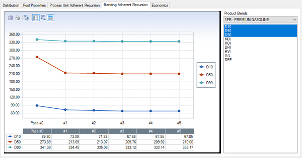
For example, the 10, 50 and 90 % distilled points for the premium gasoline product in this model have been deteremined by interpolation from the blended % Evaporated at Temperature properties of its components.
While you can put a lot of information in the graph by selecting multiple items, I often want to compare sets of data that can't be selected as a set - such as two runs, two periods, two locations, or a distribution and a property, to see how they are different or related. Fortunately, it is only a short step to take to be able to make such comparisons. Sometimes I just open two instances of the recursion monitor and set them side by side on my screen. You can view the same database independently in each or different ones. If I want to be more rigorous in my comparison, I paste the data into Excel. Within the graph, select the left most button, in the upper-left corner – Copy to Clipboard, as circled in green in the Distribution screen shot above. Choose “As Text”, then open Excel and Paste. In this way you can collect data from a number of runs. Only the data currently being displayed is taken, so by adjusting the filtering on Recursion Pass you can, for example, collect only the initial values or only the final ones.
There are a lot of very useful things to be learned from studying this output - for example, improving the initial estimates or finding extreme swings in quality that can cause bad recursion behaviour.
From Kathy's Hotel Room
Neustadt a.d. Donau 27th February 2018.
Neustadt a.d. Donau 27th February 2018.
Comments and suggestions gratefully received via the usual e-mail addresses or here.
You may also use this form to ask to be added to the distribution list so that you are notified via e-mail when new articles are posted.